← Work

Brand · Product Design · 6 months

Golfixx

An identity for an Auckland screen-golf facility that had to work on a building and in a checkout, built as a system and still running the live site.

Role
Brand & web design, freelance
Client
Golfixx · Wairau Valley, Auckland
Scope
Identity, guidelines, templates, photography, site design
Live
golfixx.nz
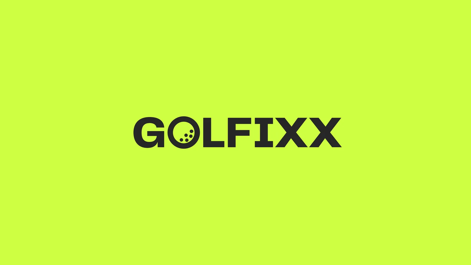
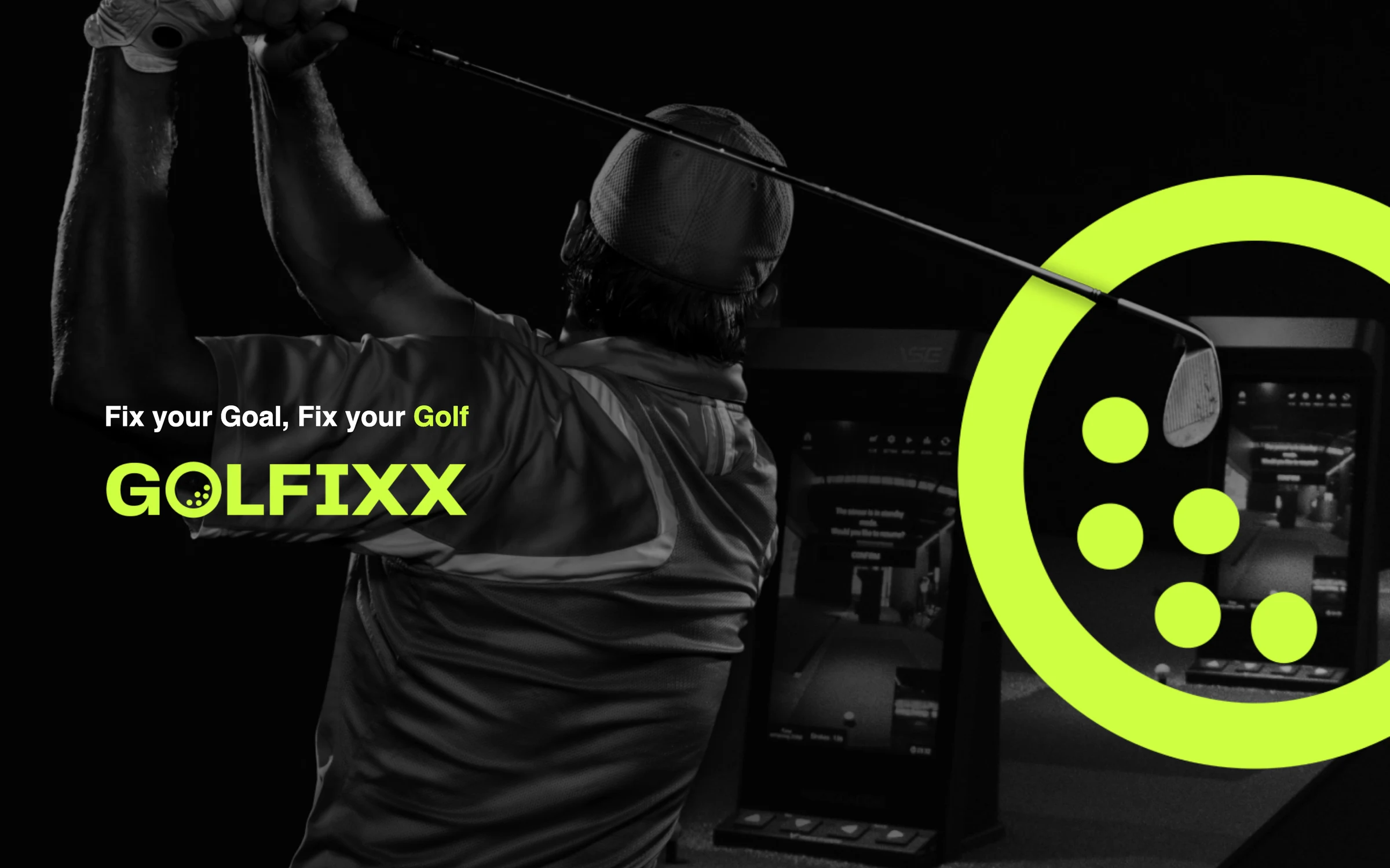
Golfixx: The resolved lockup, reversed out of the accent colour. The
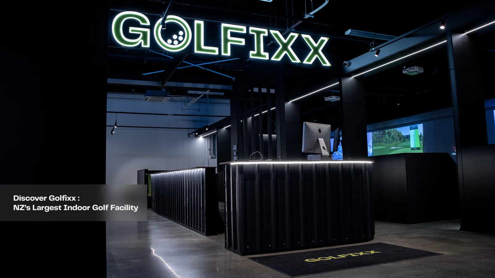
The resolved lockup, reversed out of the accent colour. The brief asked for one identity to serve both the website and the building itself, so the mark had to hold as a solid shape at signage scale, not only as a fine outline on screen.

How might we create a visual identity that represents the brand Golfixx, and create an e-commerce experience for new customers?

The brief

Golfixx is a screen-golf facility in Wairau Valley, Auckland. The business needed one identity that could carry both its digital presence and the building itself, which is a harder constraint than it sounds: a mark that survives being painted at architectural scale also has to hold at favicon size.

Six months, and the only designer on it. The scope ran from logo through brand guidelines, templates, photography and videography to the design of the site.
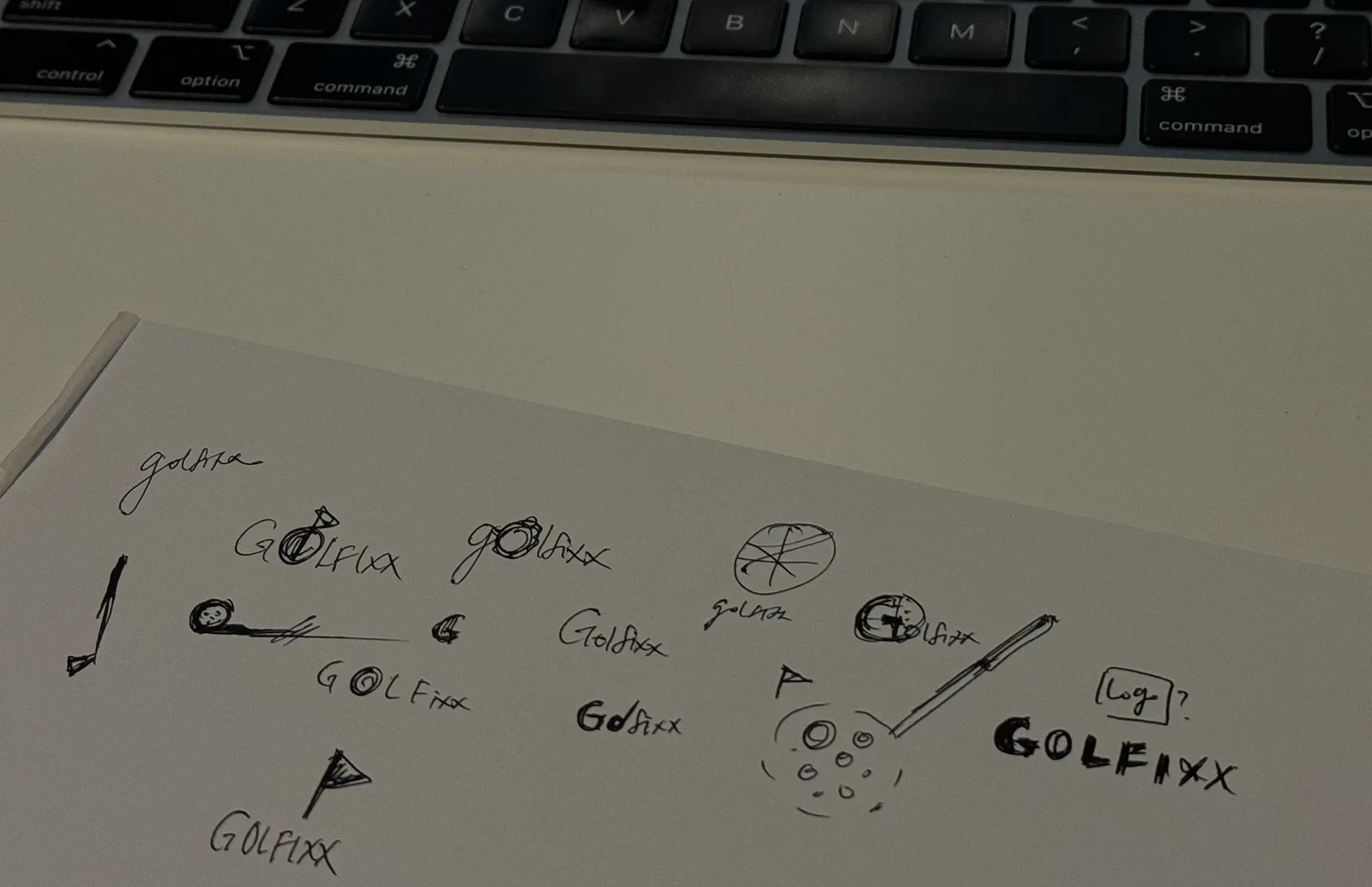
Golfixx: Where it started. A page of hand exploration working the wor
Where it started. A page of hand exploration working the wordmark, the club and the ball against each other before any of it was drawn properly.
Golfixx: plate 1
Golfixx: plate 2
Golfixx: plate 3
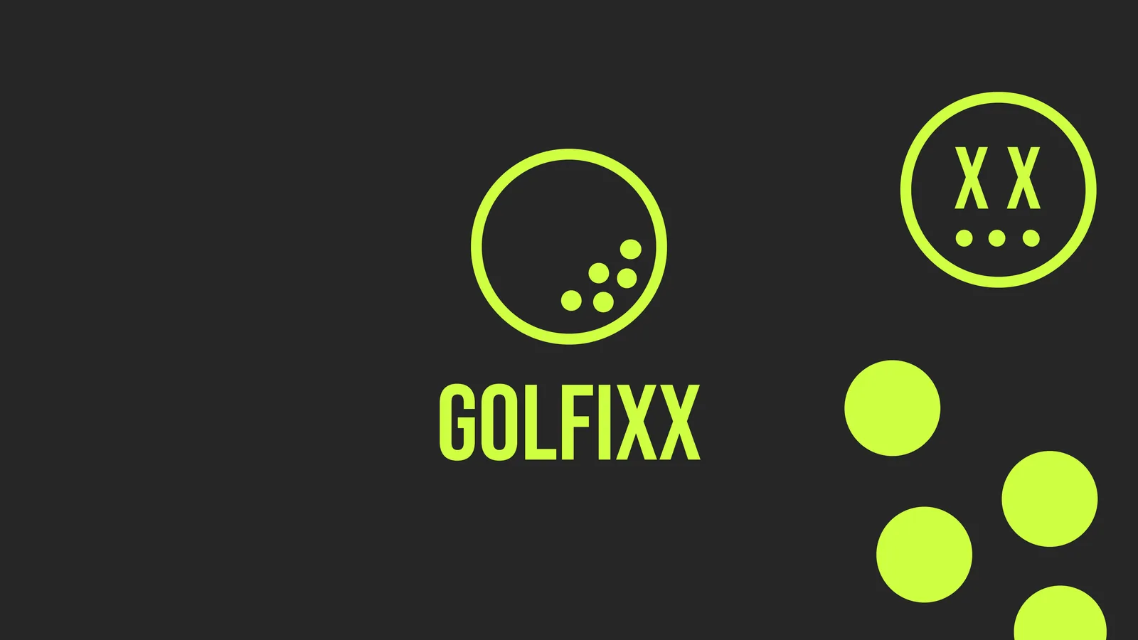
Two explorations and the answer. In the first two the ball is a separate outlined mark sitting above the wordmark; in the third it is filled and set inside the O. That change is the whole decision, because it turns two elements into one shape that survives being painted on a building and shrunk to a browser tab.

The system

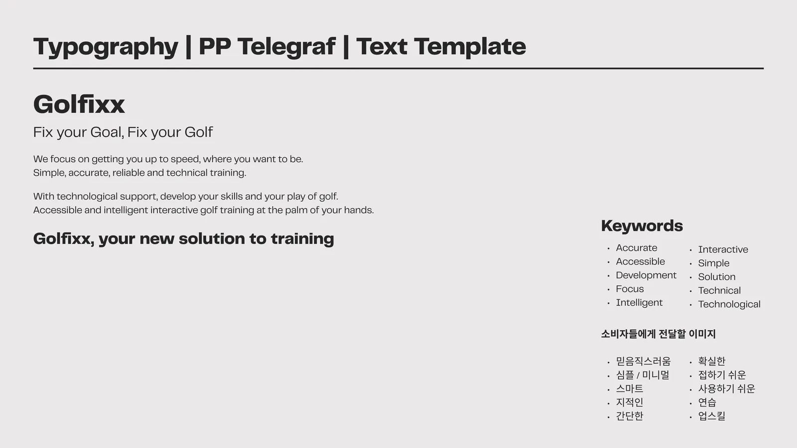
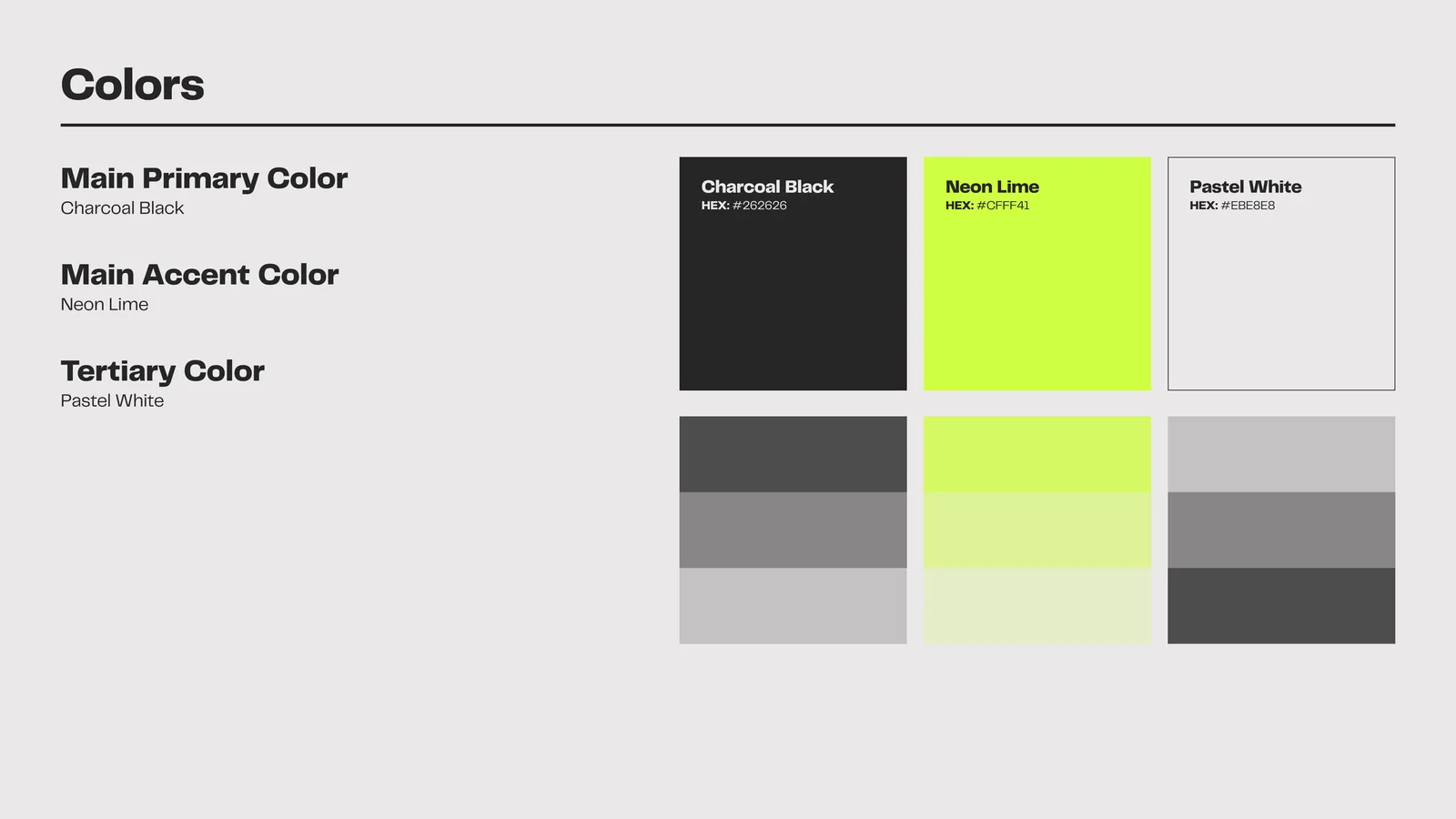
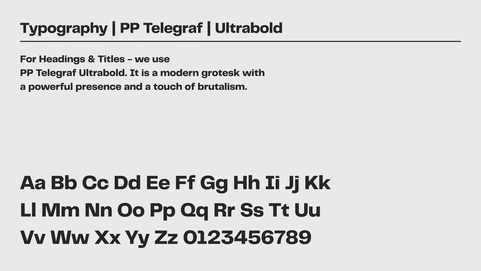
Three colours and one typeface, specified tightly enough that other people could apply them without asking. Charcoal Black #262626, Neon Lime #CFFF41, Pastel White #EBE8E8, set in PP Telegraf, Ultrabold for headings and Regular for body.

The voice is built on short imperatives, which is where "Fix your Goal, Fix your Golf" comes from.
Golfixx: plate 1
Golfixx: plate 2
Golfixx: plate 3
Palette, type scale and applied voice. Guidelines exist so a business can keep making things after the designer leaves, so the templates matter more than the poster.
Golfixx: plate 1
Golfixx: plate 2
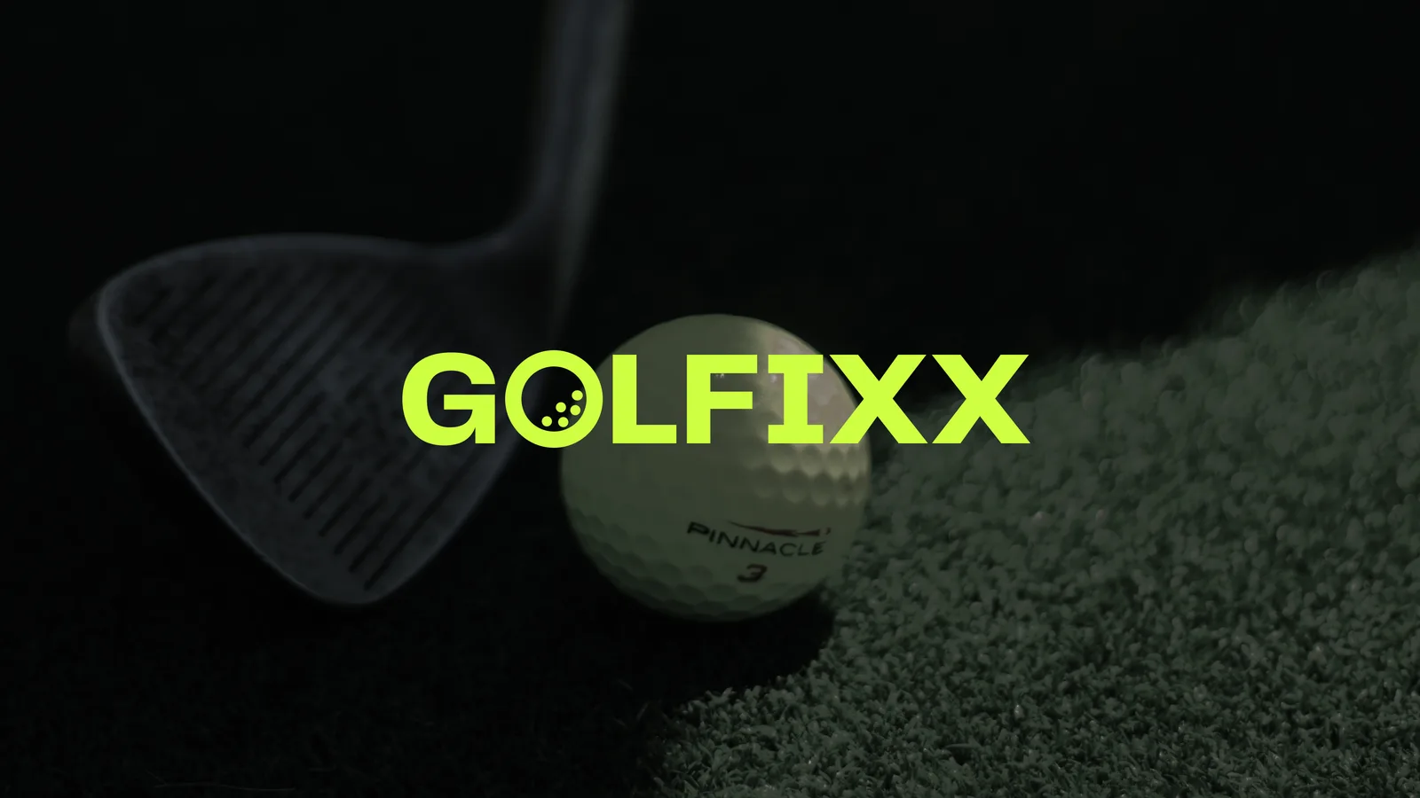
Photography was part of the engagement rather than sourced in. The facility is dark and screen-lit, which leaves the lime as the only bright thing in frame.
Golfixx: The site as it stands today. The tagline is still the first
The site as it stands today. The tagline is still the first line on the page, and the ball mark still carries the right-hand side of the hero.
Golfixx: The commercial half of the brief. Memberships and casual rat
The commercial half of the brief. Memberships and casual rates side by side, priced in the open, so a first-time visitor can work out what an hour costs without contacting anyone.

What held

The useful test of an identity is not the presentation, it is what survives contact with a working business. Checking the live site against the guideline: all three specified colours are still in use, PP Telegraf is still the only typeface loaded, and the tagline is still the first line on the page.